 Lots of small companies don’t get it right with their websites and, to a certain extent, that’s ok because their focus is on their core business.
Pump – the makers of plastic bottles they fill with water – are owned by Coca Cola Amatil and, it could be argued, they are an enormous marketing machine whose product costs less than the packaging, distribution and marketing do.
Being part of Coca Cola there’s the expectation that they will do marketing well, really well. So I was really surprised at this little snafu. Surely the company has guidelines for different types of marketing activity – or a template of tried and true steps. I know they’ve done this kind of thing before in NZ, surely they have in other countries too?! Don’t they share their knowledge within the company?
I’d been volunteering for the Auckland Marathon during registration and the volunteers were all given a banana and a bottle of Pump water midway through their shift.
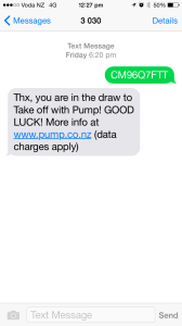
The Pump bottles have a code on them that you can text through to enter a competition. You get a response telling you there is more info on their website. I figured that I’d enter during a lull in the flow of runners registering and coming up to the Help Desk that I was manning.
 I’ve just entered on my phone, got the confirmation on my phone so it was perfectly logical to then go to get that “more info” using my phone.
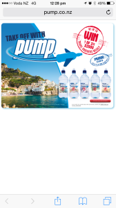
The info that I can see on my phone takes up a tiny portion of the screen and is really hard to read.
It wasn’t hard to get the gist of what the page was about but it seemed to be a waste of valuable real estate and appeared to reflect an old school, big screen mentality. I’m really astounded that the design didn’t have any responsiveness in it all.
I wanted to know if I had to keep the label as proof of entry – some Coca Cola competitions have done that and I’ve ended up with a desk of flimsy plastic labels.
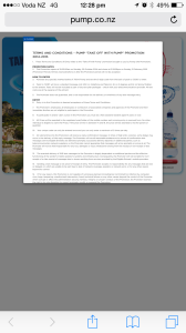
 I clicked on the Terms and Conditions button – oh and what a joke. They seriously think I’m going to be able to read this on my phone
FWIW I never actually found out if I needed to keep the label.
Hey –
Great post – I totally agree, some companies are just worried about the brand and sales,
I for one, for the last four years have made all my websites responsive,
I check my websites on friends phones and also my phone etc,
The funny thing , is as I was downloading a new copy of Filezilla tonight, I saw a banner ad on Sourceforge for ONE CLICK payments by Brain Tree and PayPal ,
They were launching and promoting a new product for webmasters/ phones, so you could check out in one click with your phone,
So bringing this back around to what you said, yeah, some companies need to catch up fast :))
Great post, Keep writing,
God bless
Joseph
Hey – its 2016 and some website are still not responsive 😉 PS – You should pit amazon ads on this blog 🙂